VALSPAR
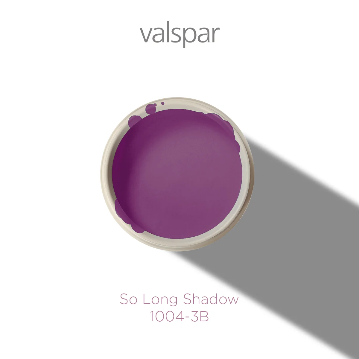
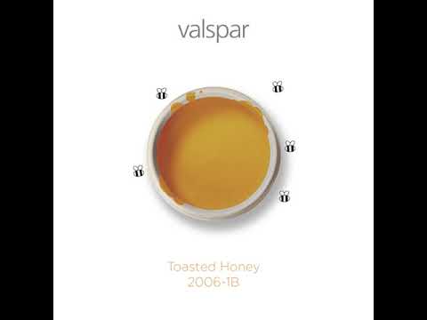
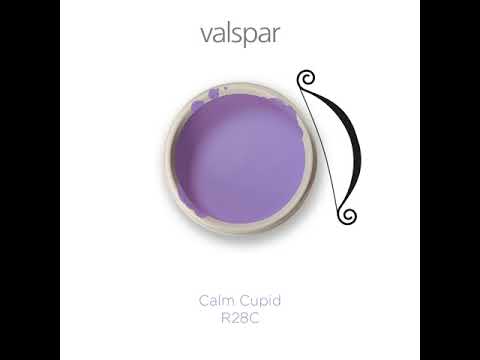
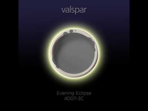
Valspar wanted a new way of presenting their product online. I had the idea to use the pot to embody the name of each particular colour. Thanks to the round shape and Valspar’s quirky colour names, this turned out to be a fun and successful project. A few of them lent themselves very well to be animated too!


